


OOOH PHO- BRANDING IDENTITY
Oooh Pho is a brief given by @brand.brief on Instagram.
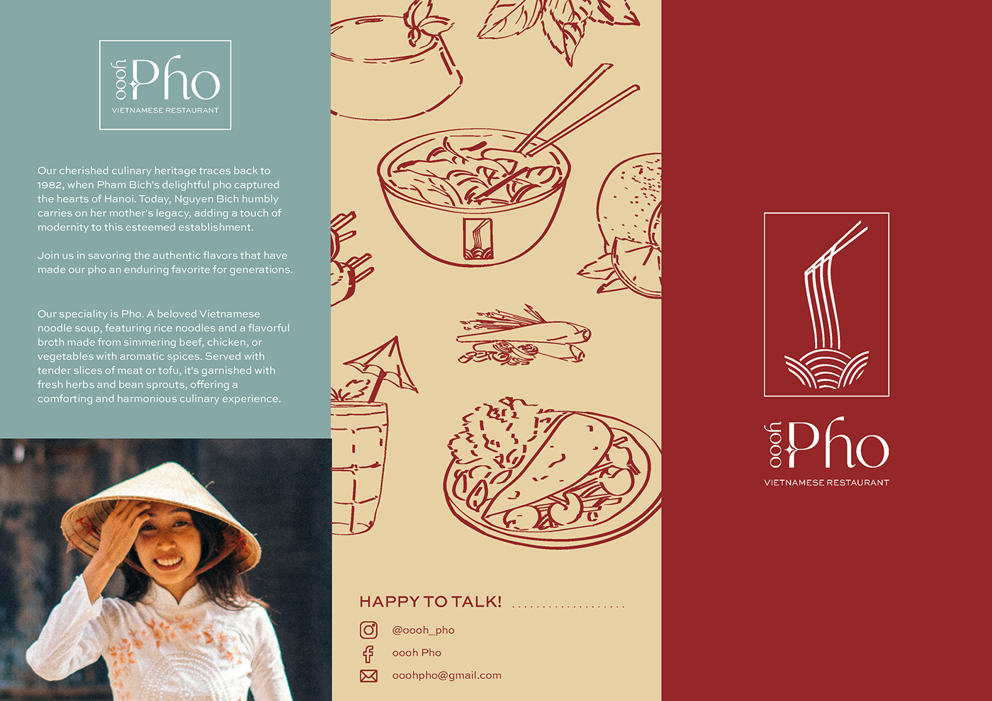
Oooh Pho's cherished culinary heritage traces back to 1982, when Pham Bích's delightful pho captured the hearts of Hanoi. Today, Nguyễn Bích humbly carries on her mother's legacy, adding a touch of modernity to this esteemed establishment whilst continuing to serve customers the authentic flavors that have made their pho an enduring favorite for generations.
With the branding, I've aimed at staying true to Vietnam as well as Pham Bích. The interplay between graceful typography, illustrations and bold yet pleasing colors give oooh Pho the elegance, novelty and class it set out for.
LOGO DESIGN
Oooh Pho's logo design was kept simple and to the point whilst remaining classy. Just how elegant brush strokes are used in some of Vietnam's old art, I chose to depict Pho with lines similar to them. The typography is clean and elegant- which reflects the delicate art of making the dishes.


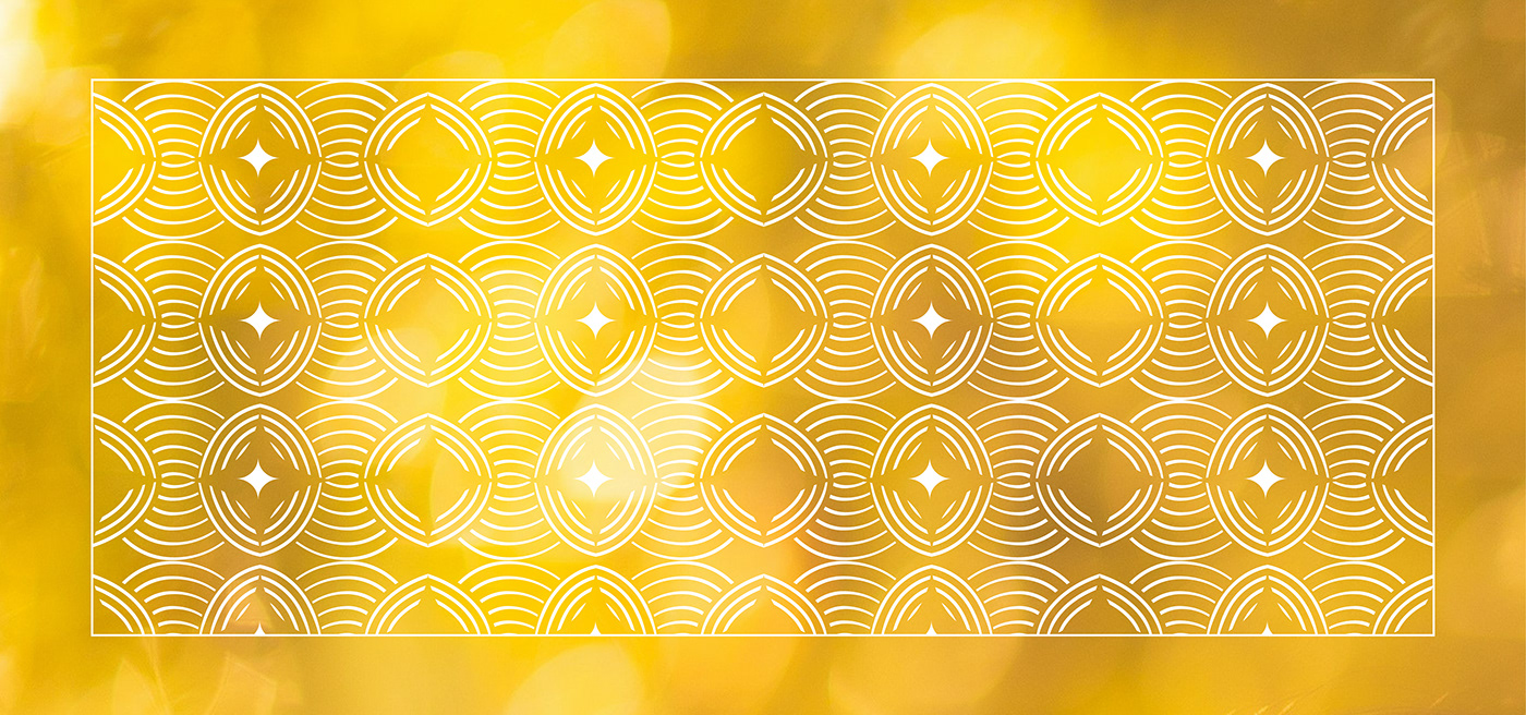
Pattern Design derived from the logo
FOOD ILLUSTRATIONS
Food illustrations of a couple of iconic Vietnamese dishes which were included in the menu and it’s design. This style was chosen as it matched with the slightly altering line weights of the logo, but also embraced a more handmade touch to the overall design.


MENU DESIGN
The menu was designed with authenticity and simplicity in mind. We have a small but strong collection of some of the best dishes Pham Bích, now her daughter Nguyễn Bích has to offer at oooh Pho. To connect with the diners, I thought it'd be a nice addition to include the restaurant's history and a brief introduction on their speciality, Pho.


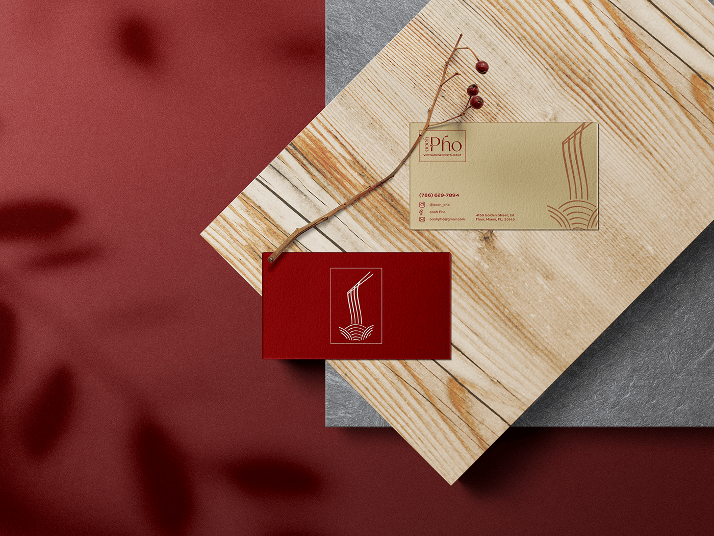
Business Card

Coaster Designs


